MSFEA

branding

The Maroun Semaan Faculty of Engineering and Architecture (MSFEA) is the best engineering school in the MENA region and has been the incubator of widely successful engineers, architects and designers for the past century and a half. It has proven to be excellent in performance, becoming one of the top choices for student, among all engineering schools in the Arab region.

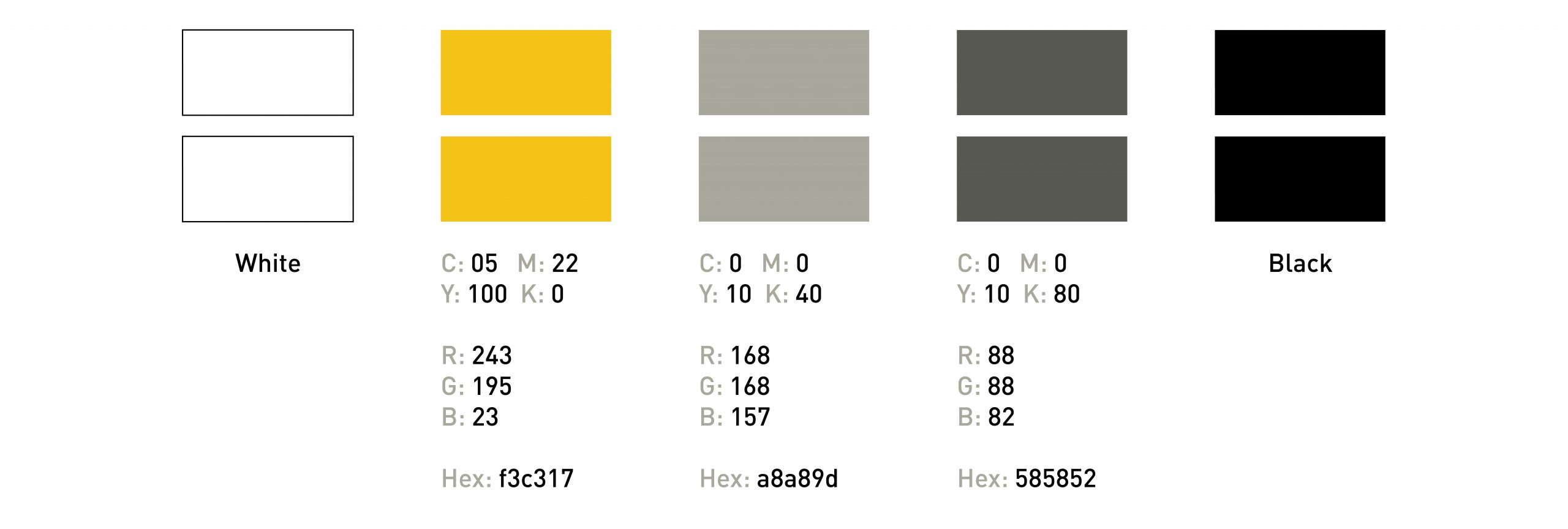
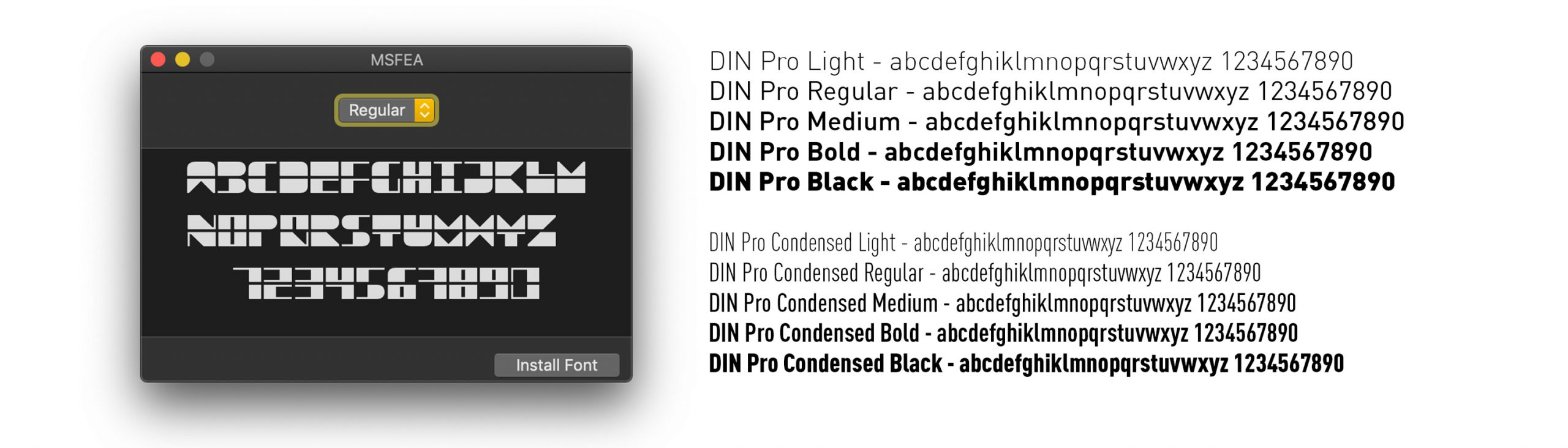
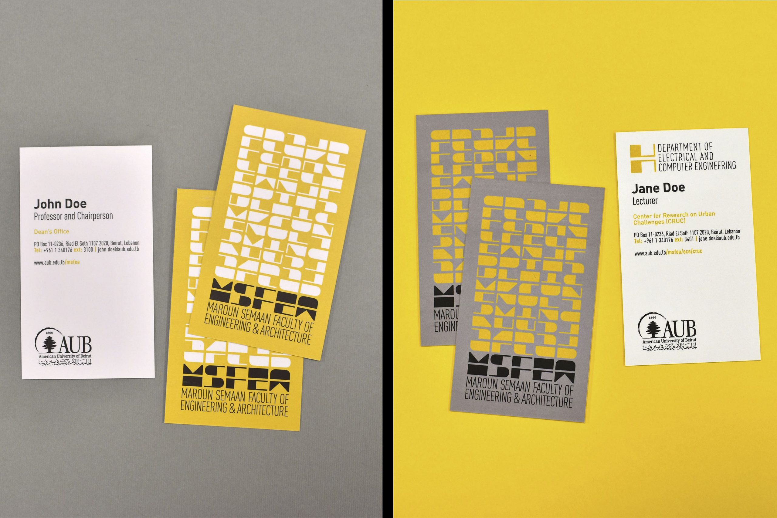
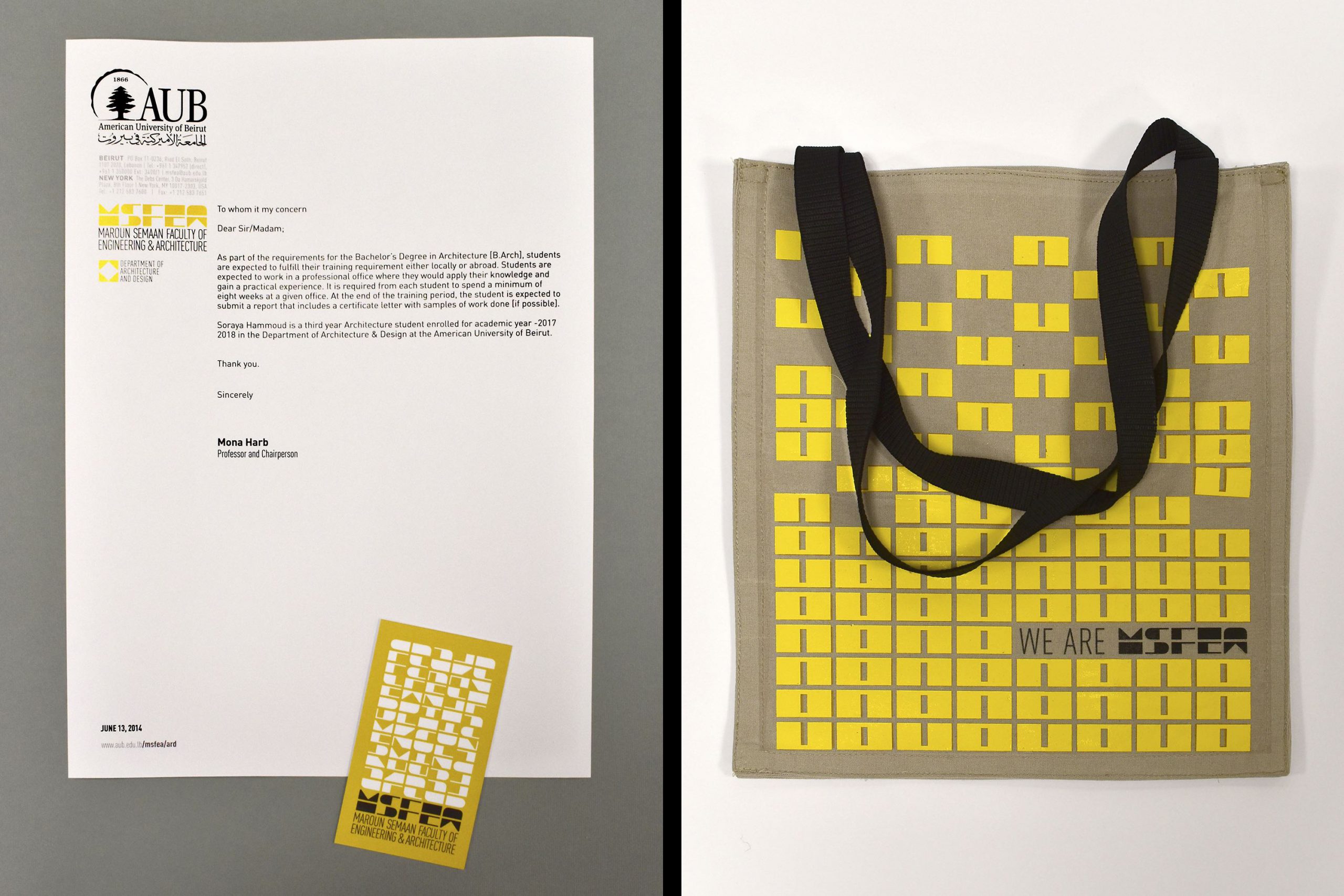
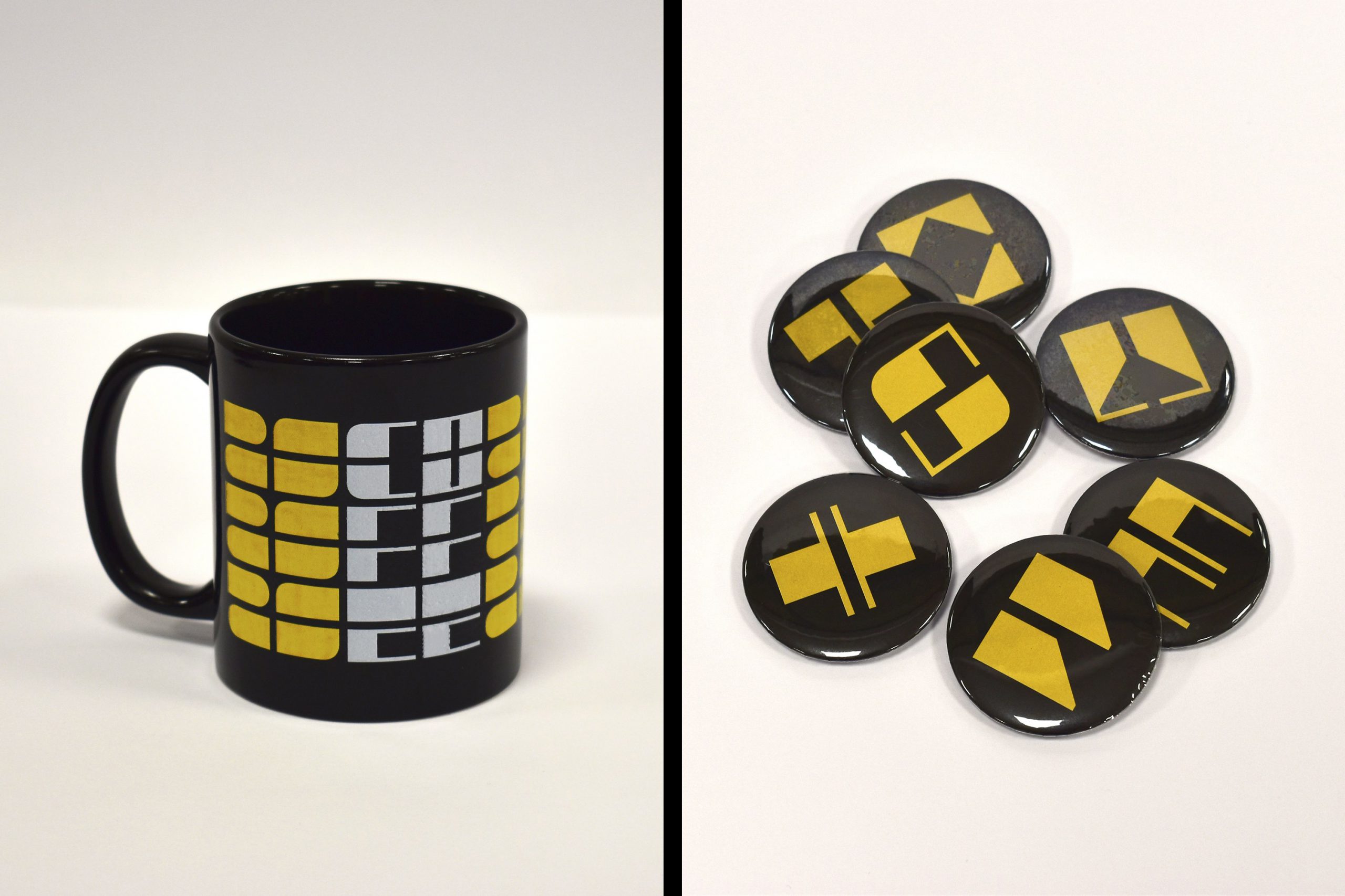
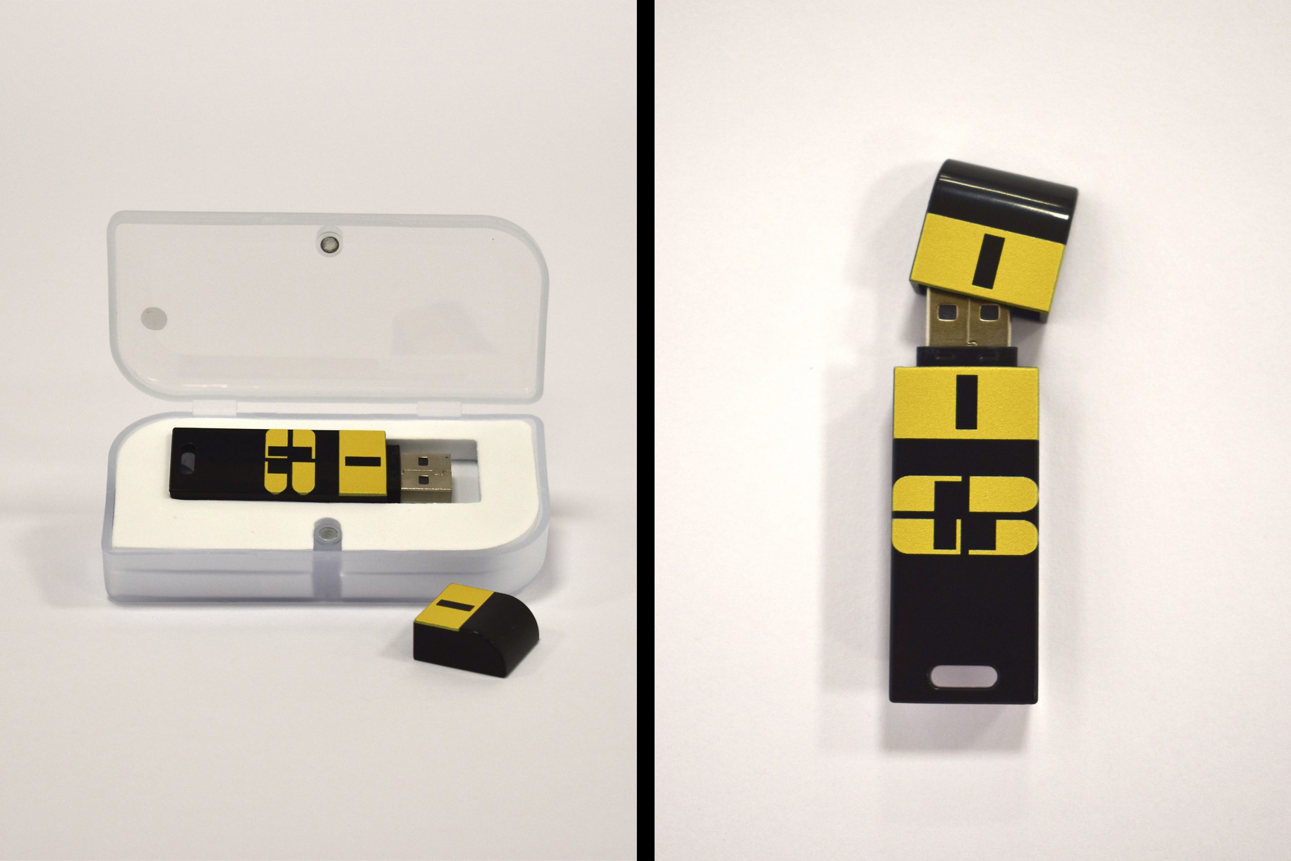
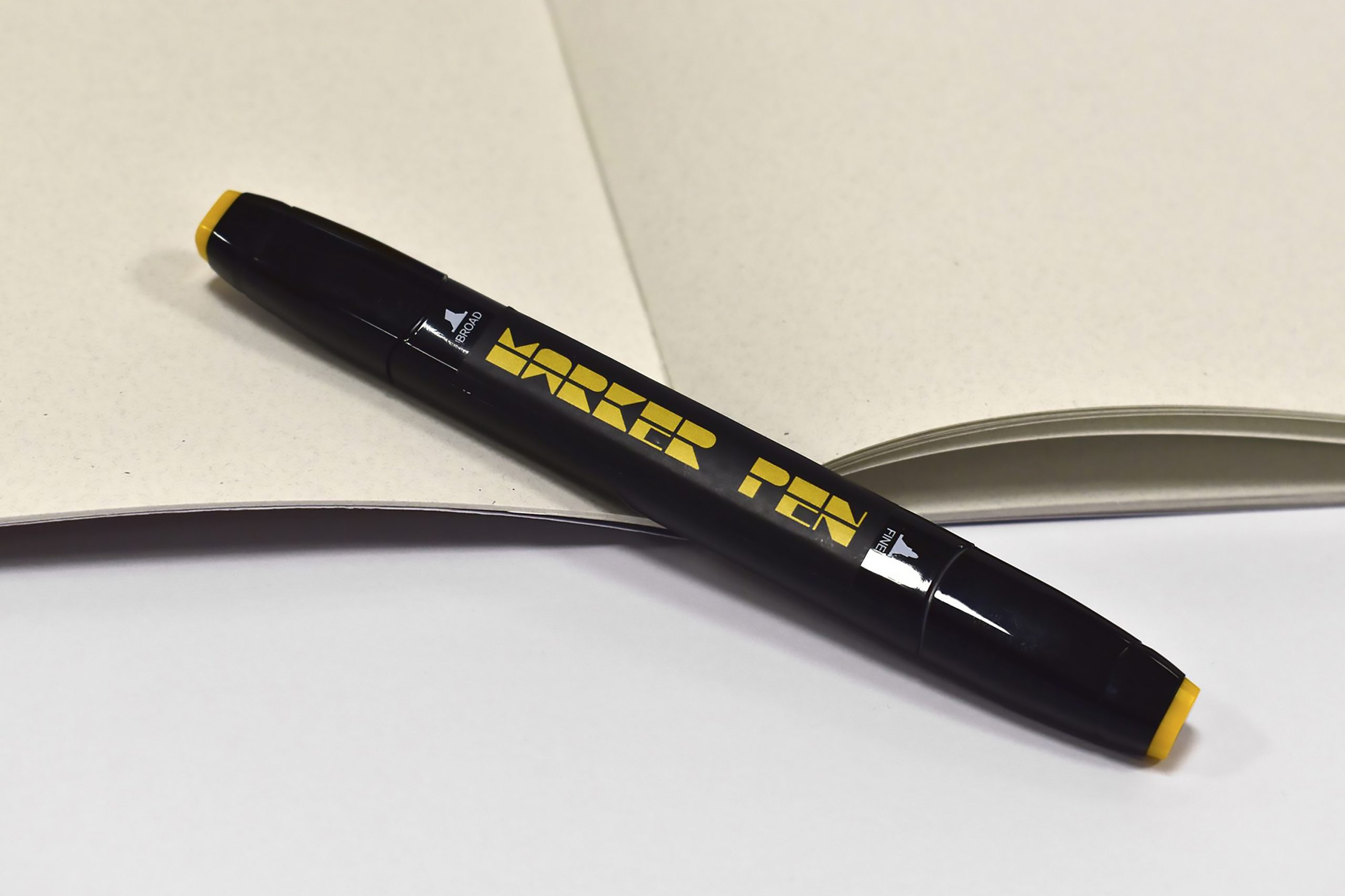
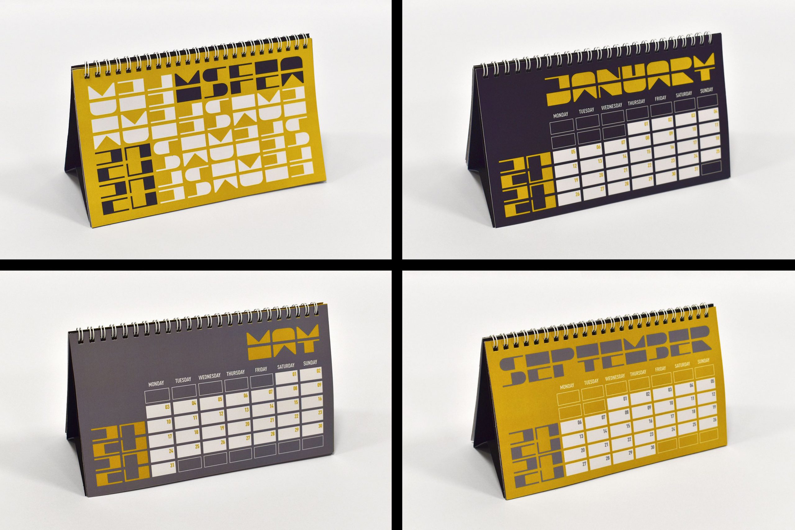
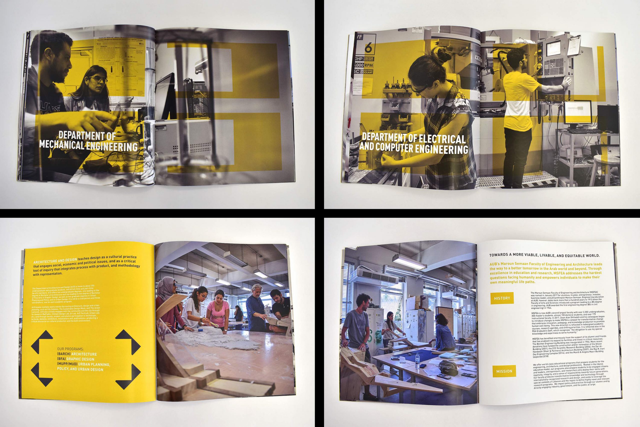
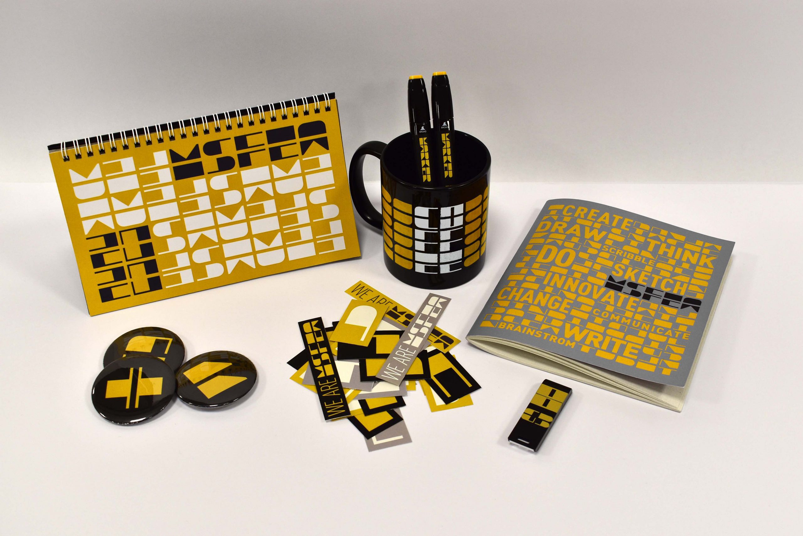
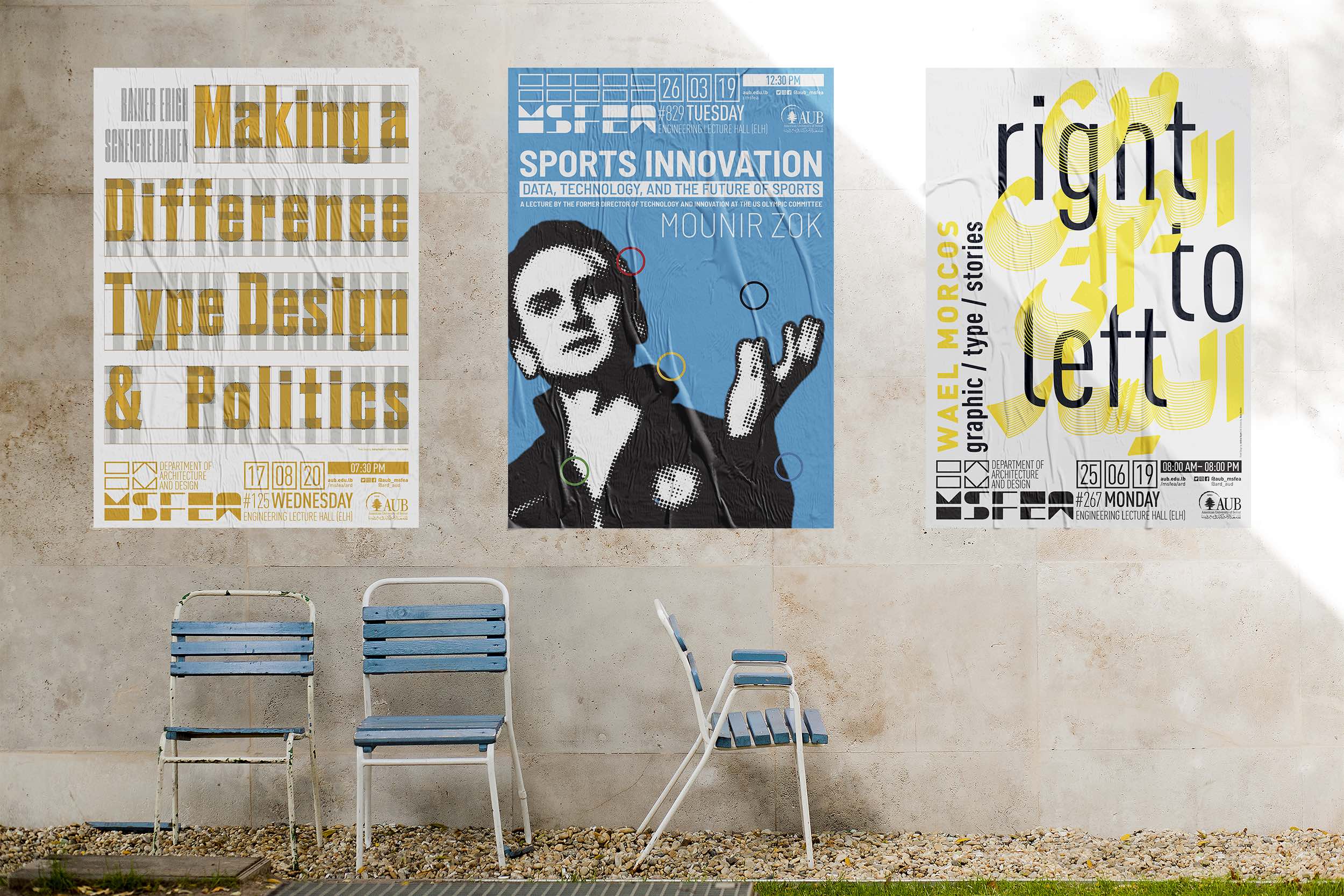
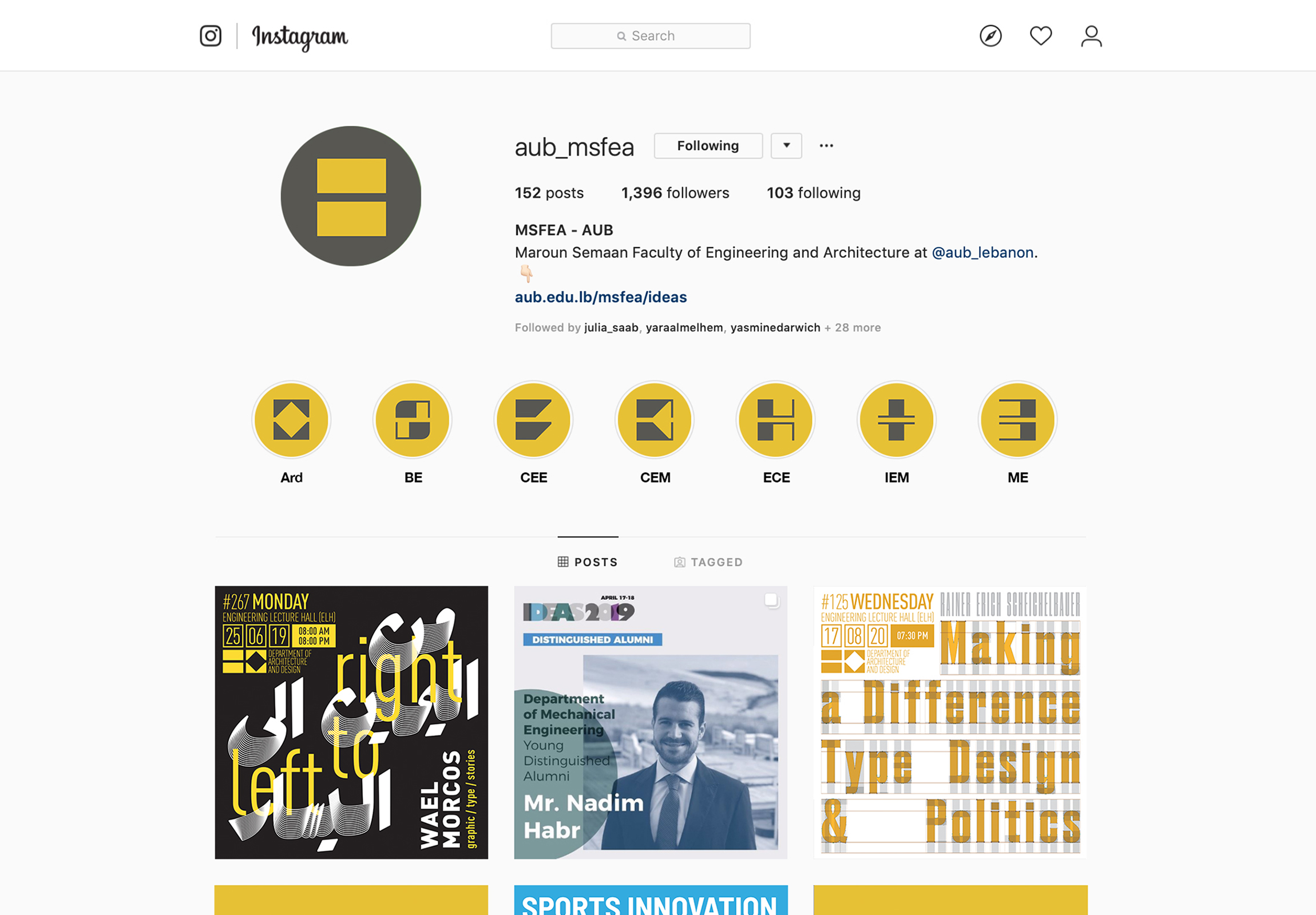
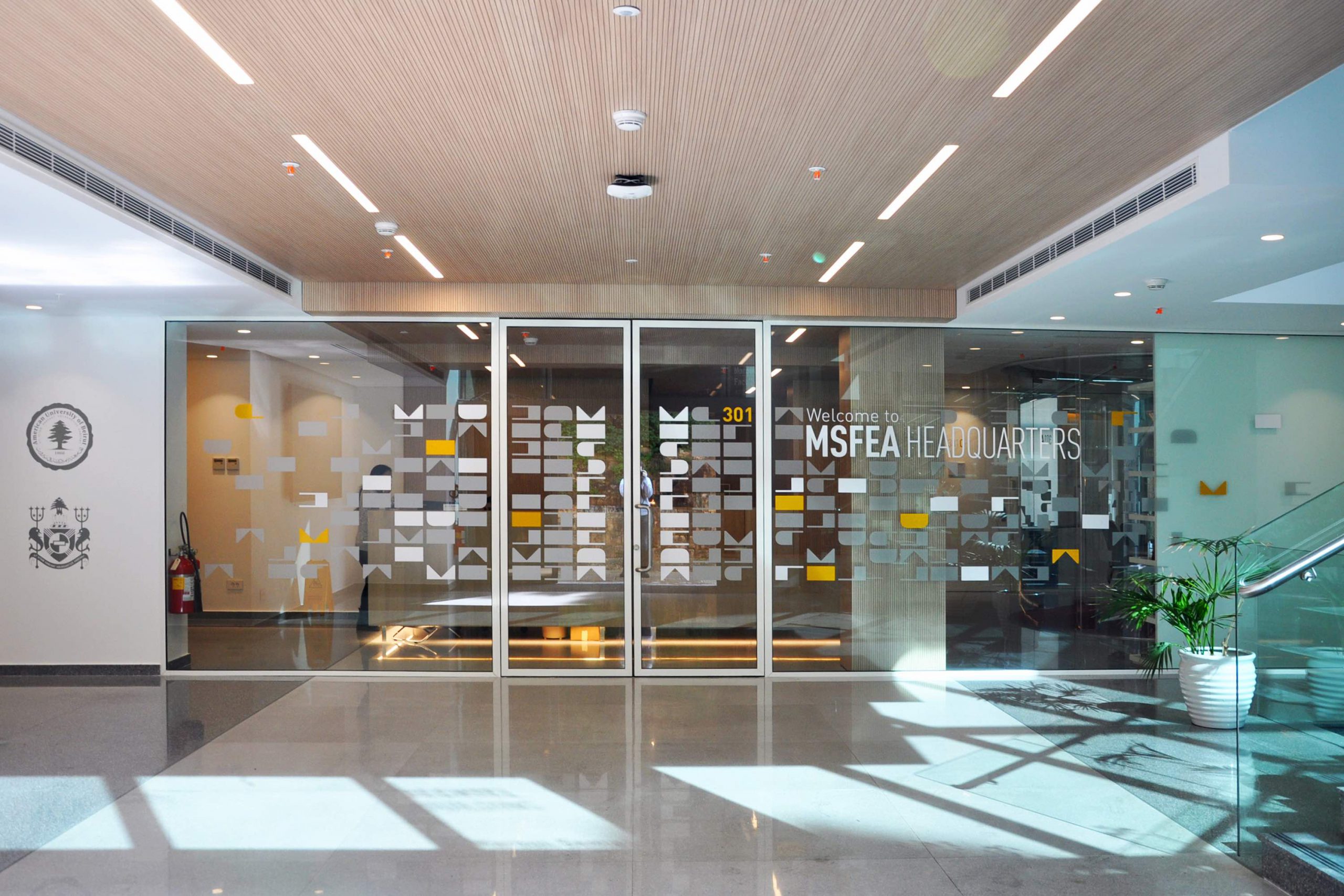
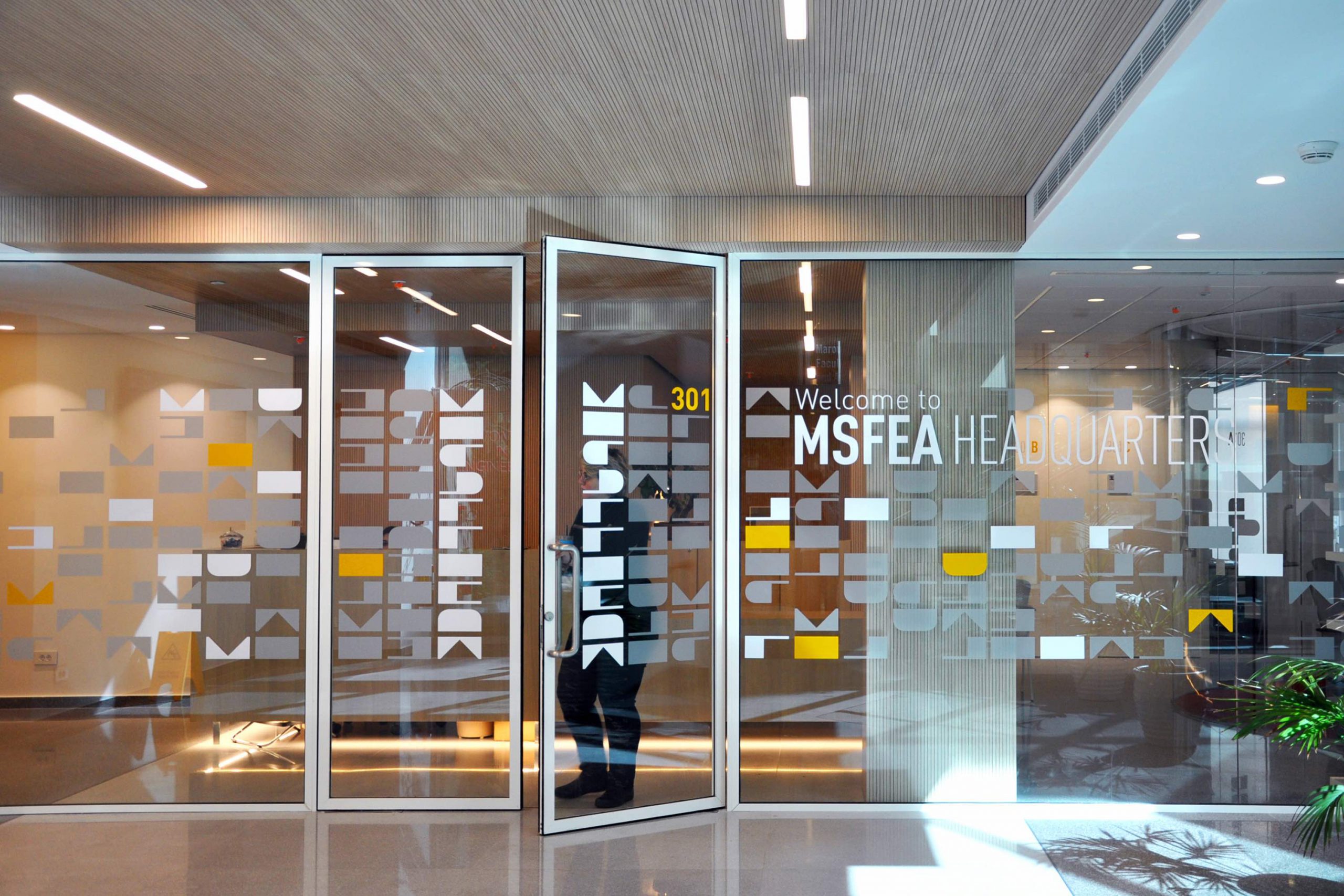
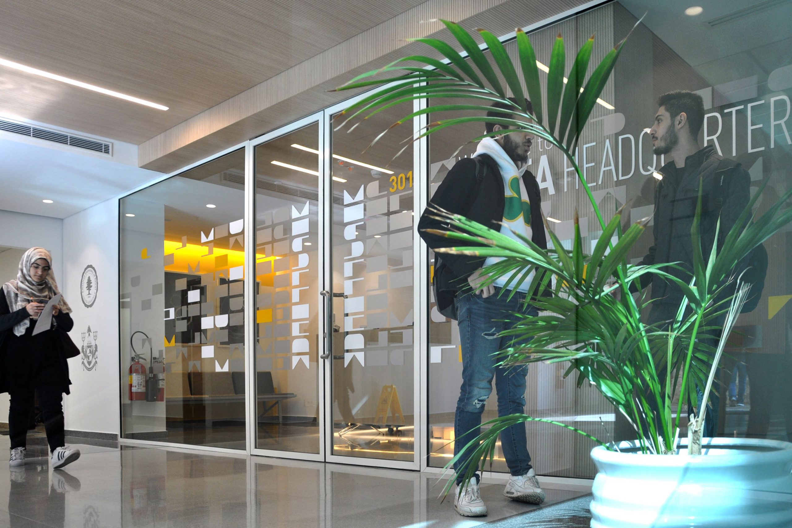
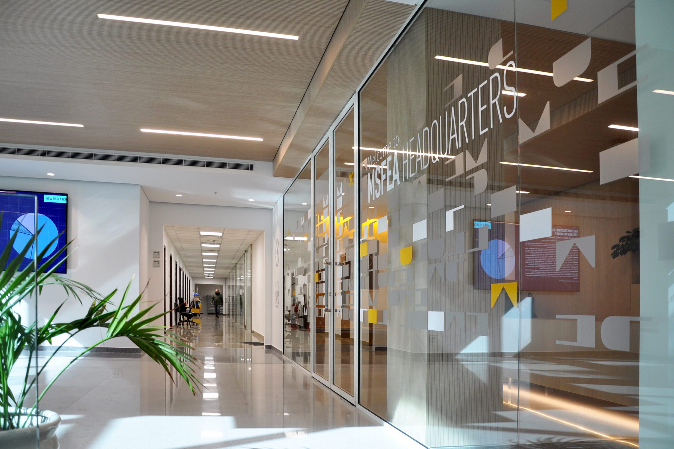
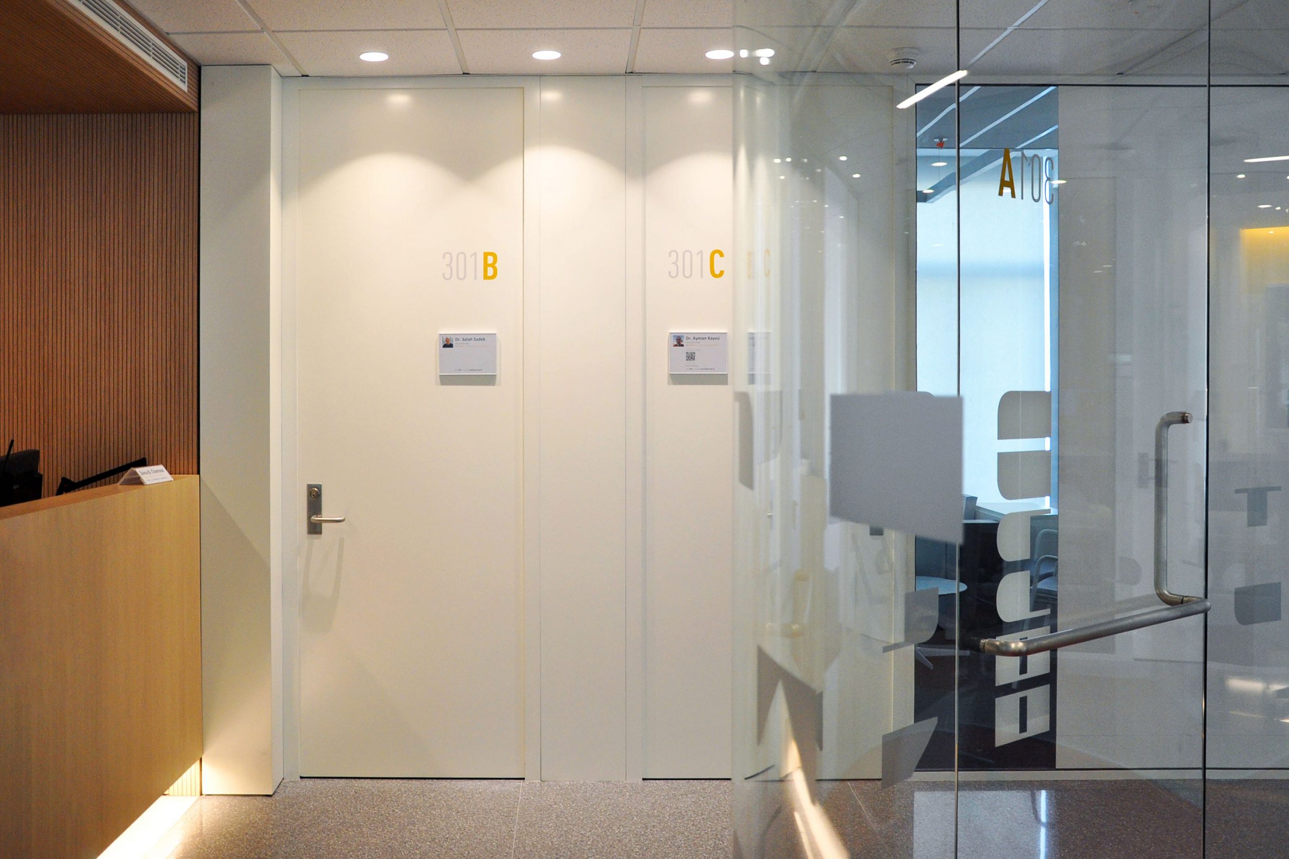
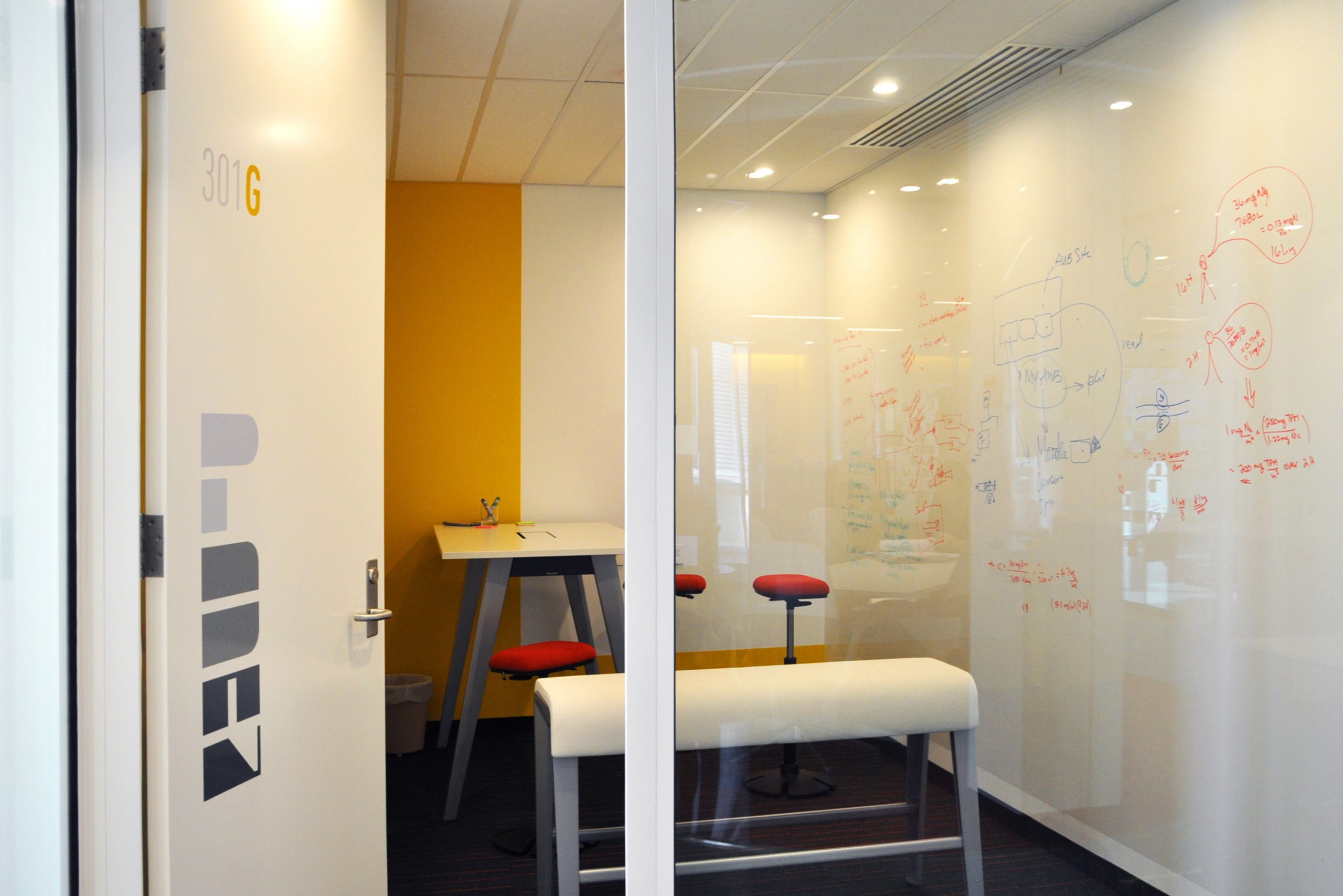
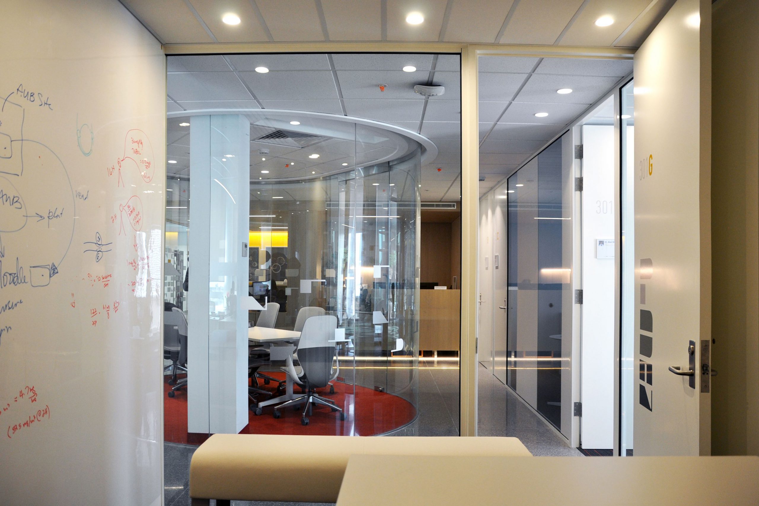
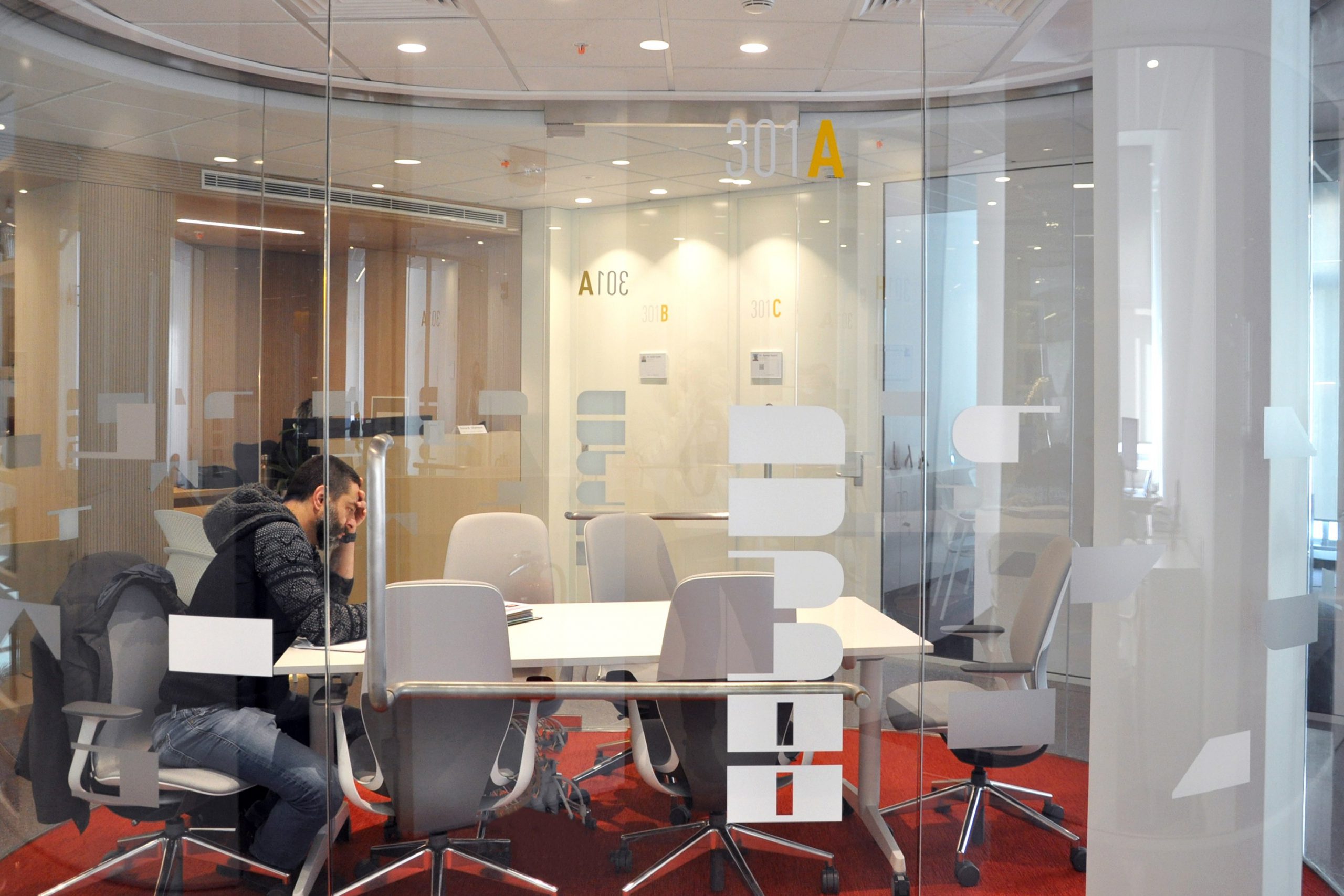
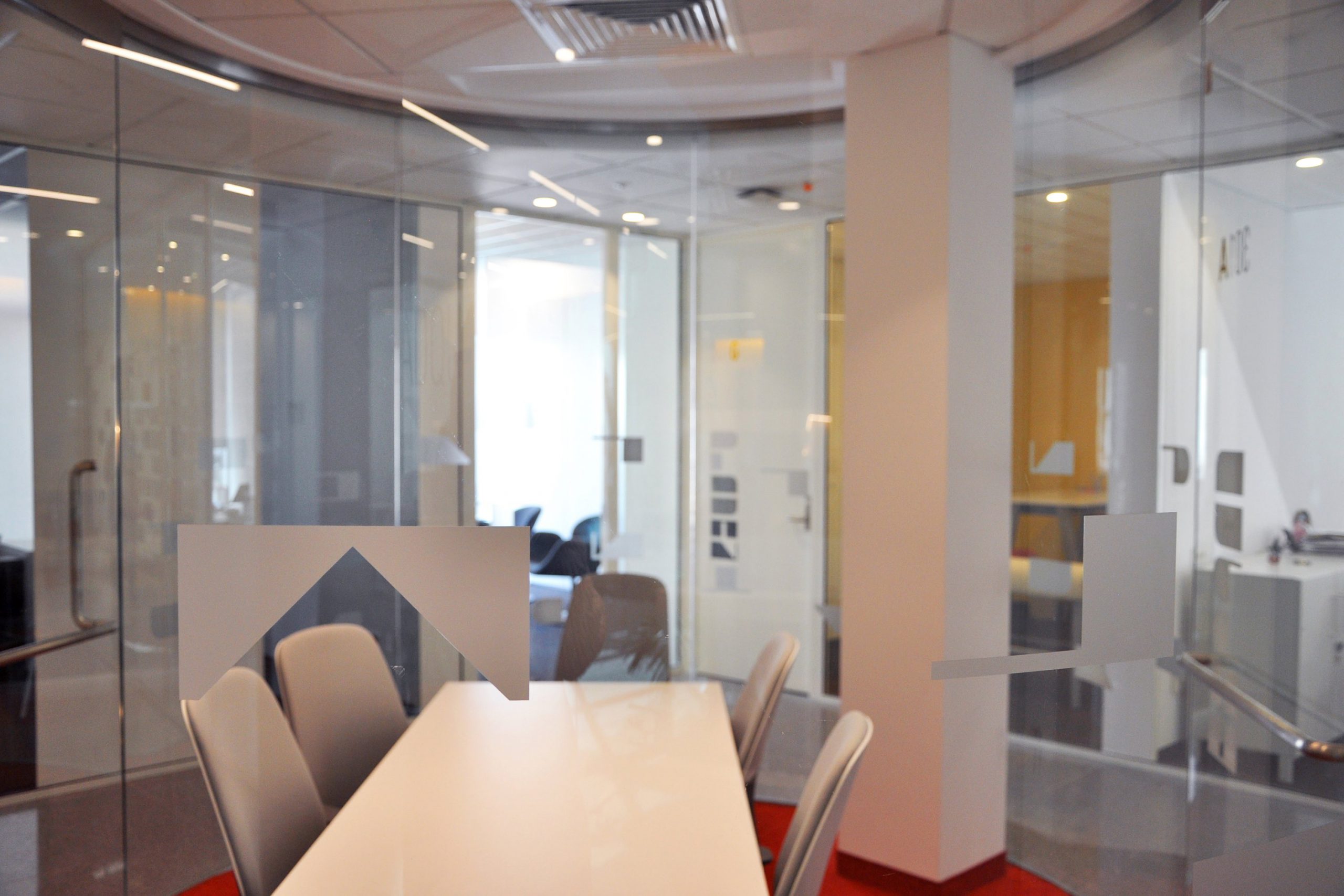
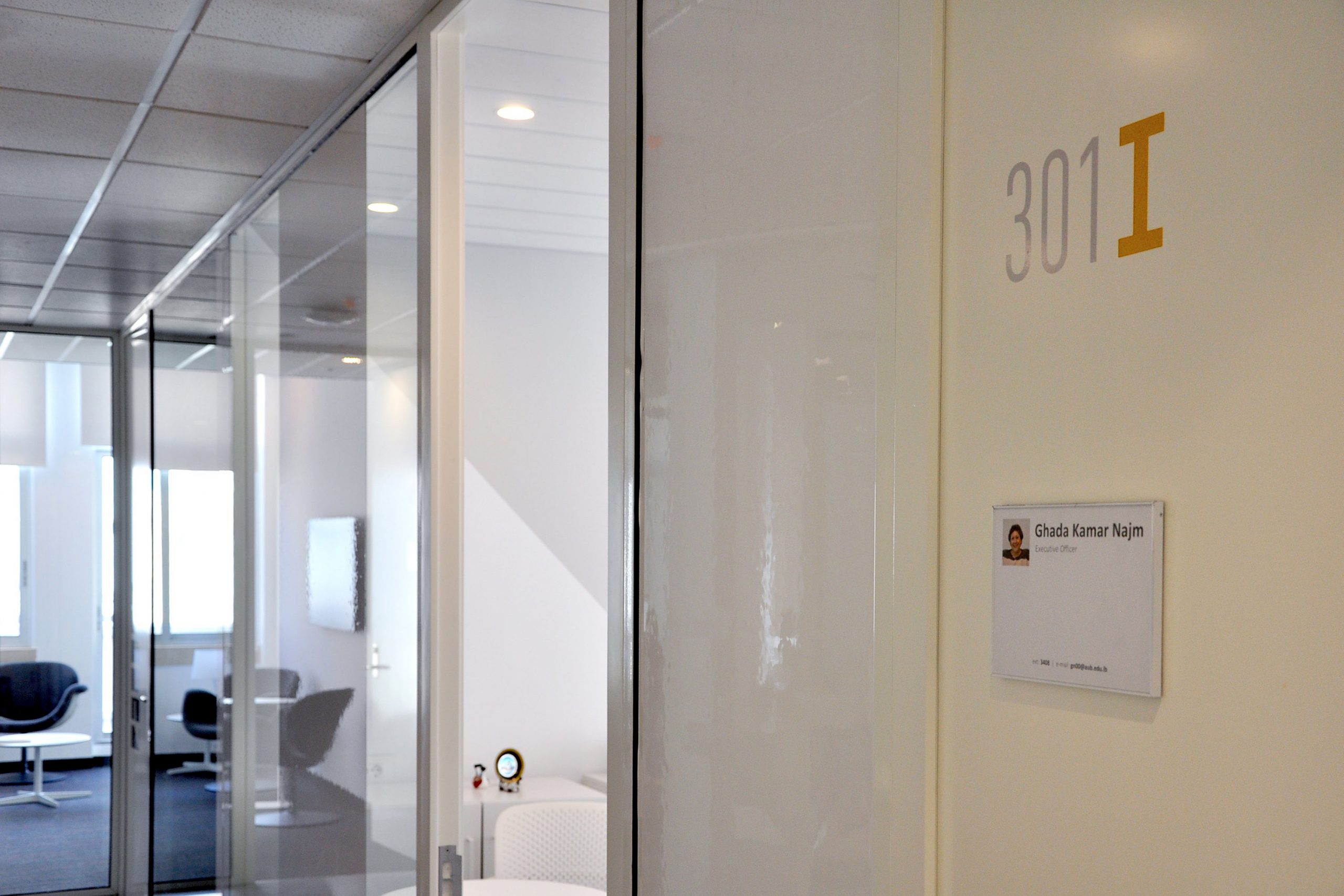
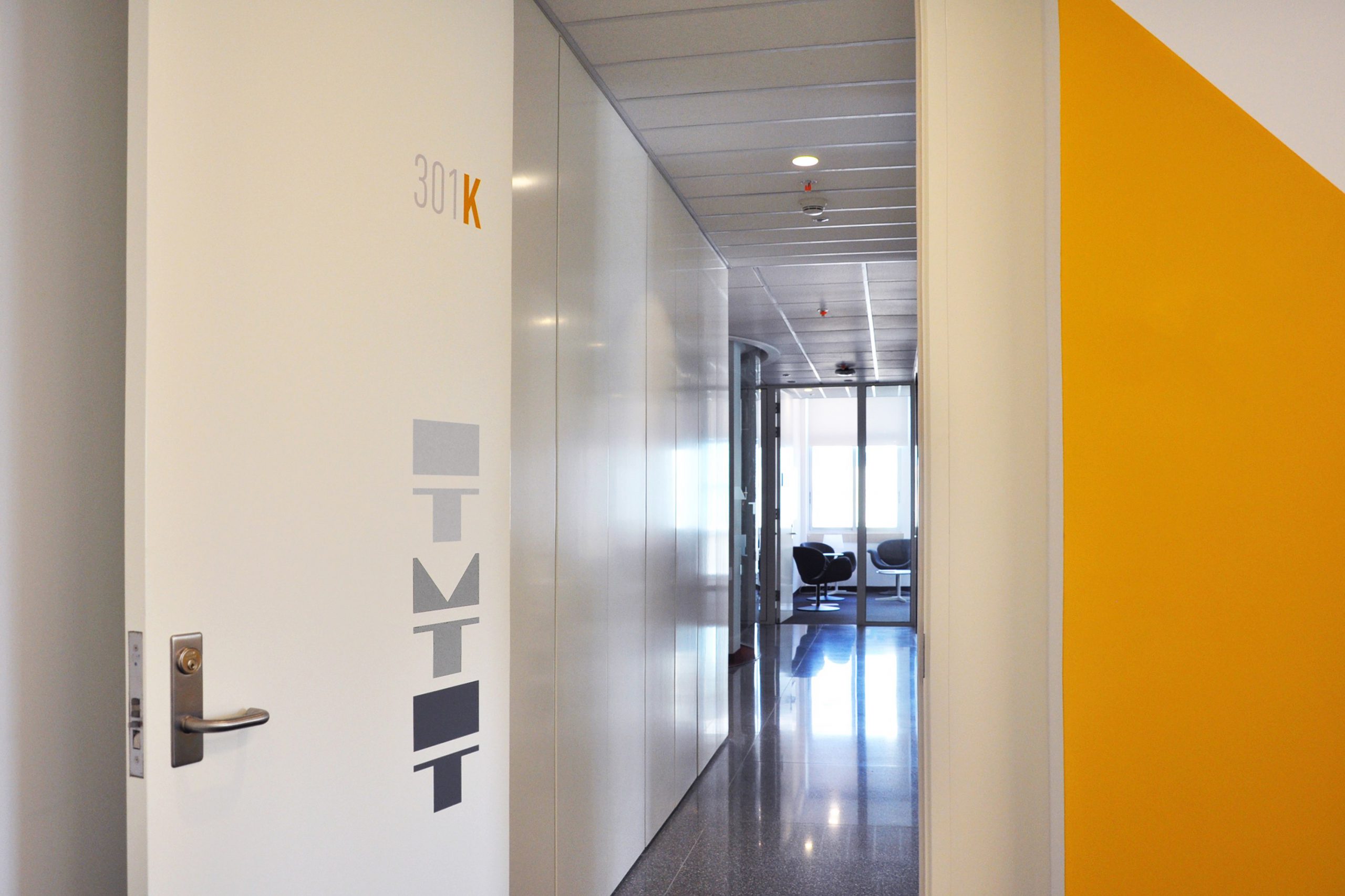
As part of my Final Year Project as a Graphic Design student at MSFEA, I created and developed a visual brand for MSFEA. My project covered a wide range of deliverables, from the logo, to the housestyle, including corporate material, outreach communication, and signage of the 6 MSFEA buildings.
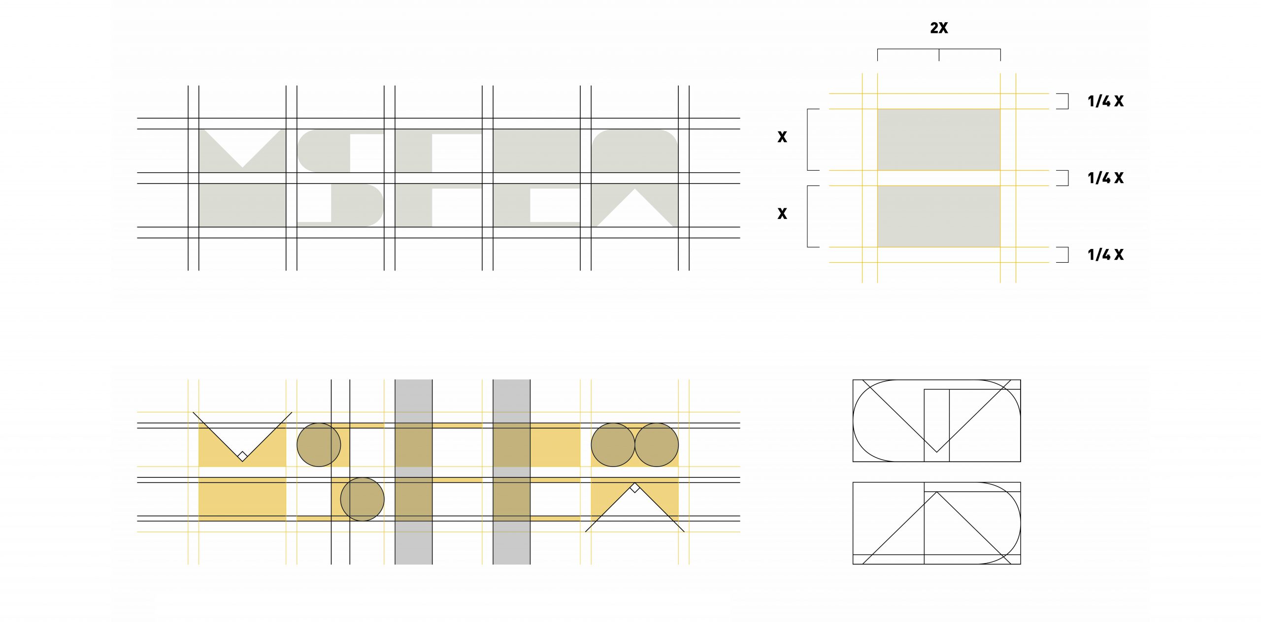
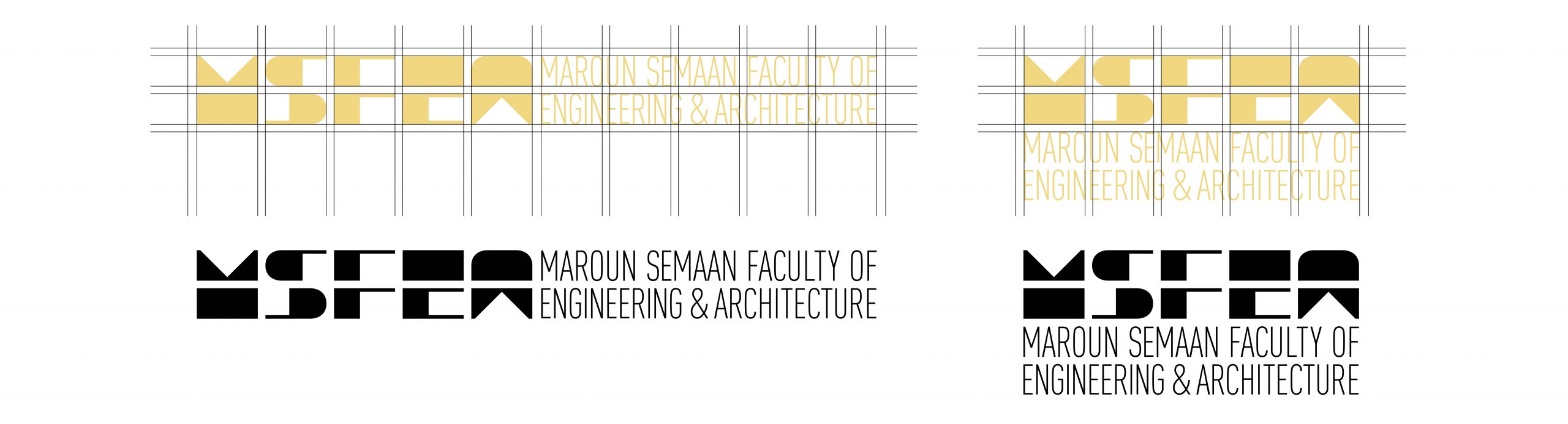
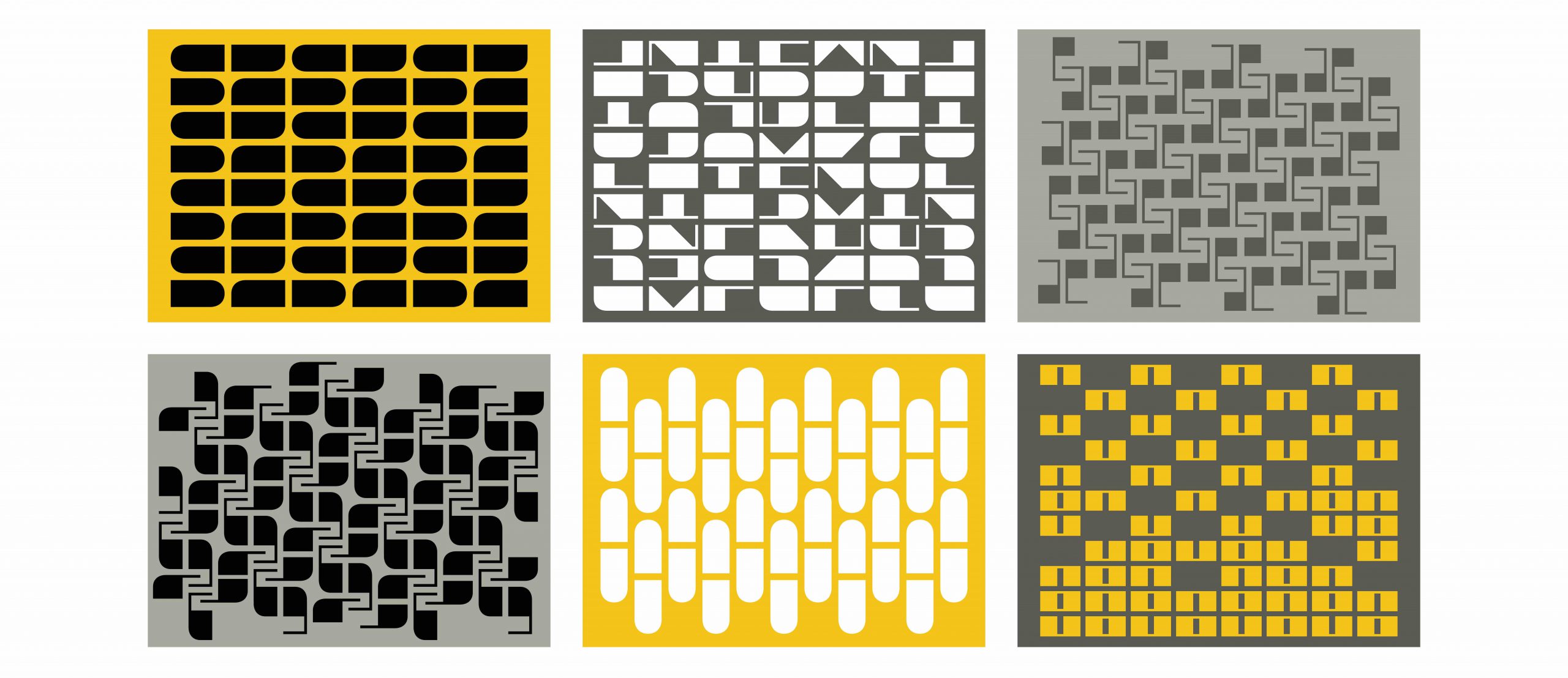
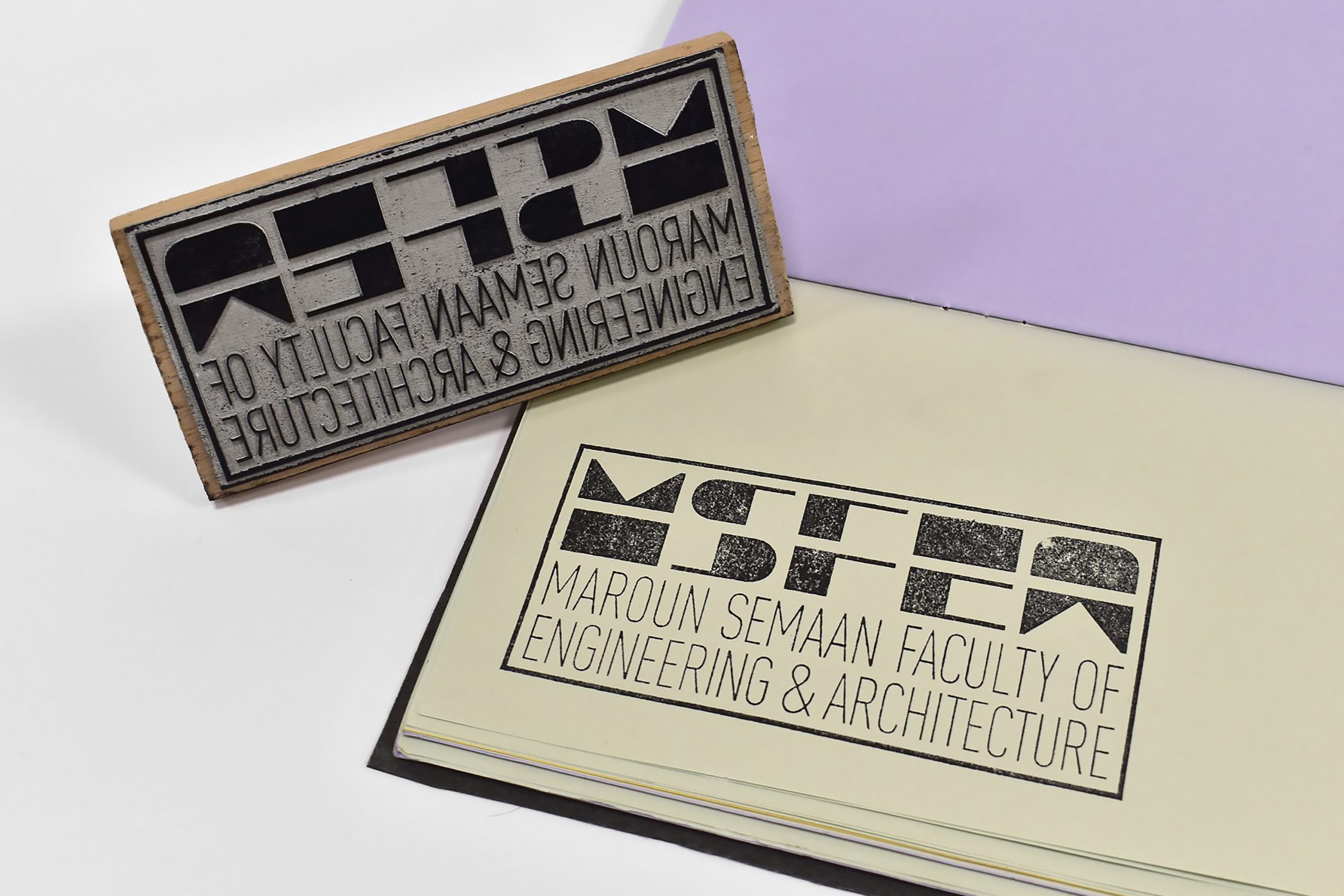
LOGO

The typography based logo portrays the confident, versatile, and vigorous personality of the faculty.

The MSFEA letters are based on pure geometric forms and angles. They sit in two modules with equal measurements across.
The complete logo has two variations, depending on the application needed.

housestyle

This is the primary MSFEA color palette.
The MSFEA warm yellow is a color that stimulates thinking and the nervous system and encourages communication and memory. It inspires friendliness, warmness and, at the same time, a ready-for-action spirit.

The custom designed MSFEA typeface, is conceived in the same system as the logo. It is a 1 weight display font, containing only uppercase letters and a set of numbers, that can be used for titles, signage, patterns and other branding purposes. 
As for the primary font palette, MSFEA will use DIN Pro with 10 different weights to provide for a very wide range of applications, from print to digital.

The many shapes that stemmed out of the MSFEA typeface can also be used to create playful patterns.

corporate

Icons have been allocated to each department of MSFEA in order to facilitate identification. These icons each consist of a symbol formed by the same element either repeated, flipped, or rotated
Each icon can come with or without the full name of the department, depending on the application.

outreach

MSFEA holds weekly events that vary from academic to cultural, from showcases to competitions, from departmental to inter-faculty. The below lock up was designed as a unifying solution for the promotional posters.

application of the project

DEAN’S WING RENOVATION

The MSFEA Dean’s Wing was renovated at the end of 2019, right when I joined the Communications Office of the faculty. And so, adopting the new branding housestyle and guidelines, we worked on the design of signage and spacial graphics of the newly built headquarters.